
Session 2
These are 10 of my favorite photos from this session that I decided to focus on and were in my opinion my best ones. I mainly used Lightroom to edit them with the exception of two photos thats i used Photoshop on.
Before
After

For this one I chose to edit in Lightroom, I wanted to lean into the softness of the photo original. I ended of increasing the red, oranges, and pinks to further bring out a softer more delicate look. I also increased the whites and highlights to give the fur some texture.
Before
After

This is one of the photos I ended up using photoshop on I loved the composition, and how was able to capture the movement of the curtain at just the right time, but I hadn’t noticed the tag sticking out. So I took it into Photoshop edited the tag out as well as her eye to bring out some vibrancy and sharpness to make it a focal point. I noticed while editing this one that I really like that slightly out of focus look which the curtain help in this shot I think it helped give depth.


After
Before
I picked this photo because of the different textures going on and also the various hues of brown and orange. I used Lightroom and focuses on using the color levels to bring out the brightness and saturations in the brown and oranges but also tone down the redness and bring out the greens in the background for contract.
Before


After
When I took this photo I purposely made sure it was off center. I already had in mind to really saturation and bring up the vibrance of the color. Another thing i noticed while editing these photos is that i really like bring in warm to a photo and therefor found myself increasing the temperature in most of the photos picked. Some other things i adjusted in this one where the sharpness and clarify and added a lens blur to push that background further back and bring more attention to the flower.
After
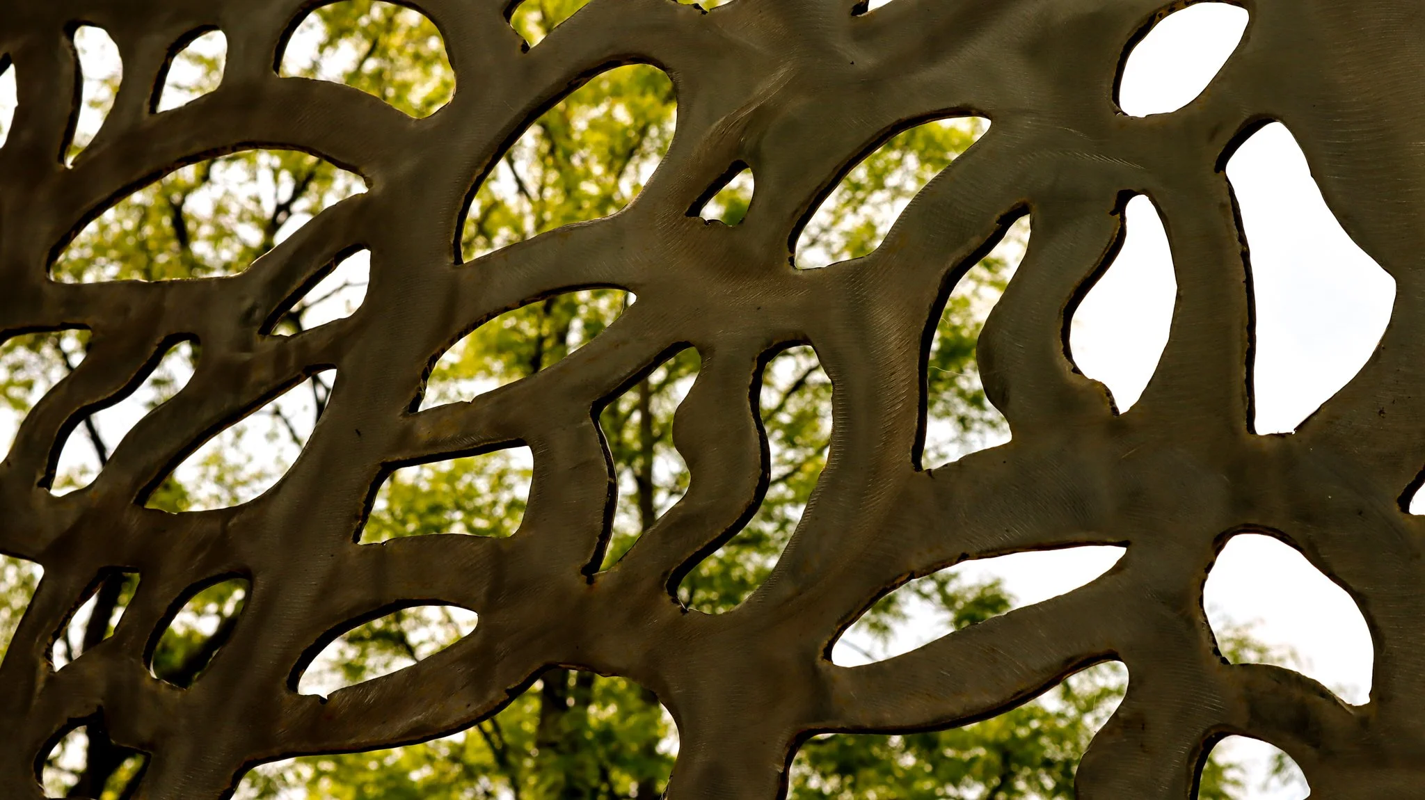
This was part of an art installation at Khlem Garden. When editing this one i did find it difficult to figure out how to edit the metal and finding what would be the best fit to make as more interesting kind of abstract photo. I brought down the shadows and blacks to give it more contrast and also made the greens in the background more vibrant to help with that contrast.

Before

After
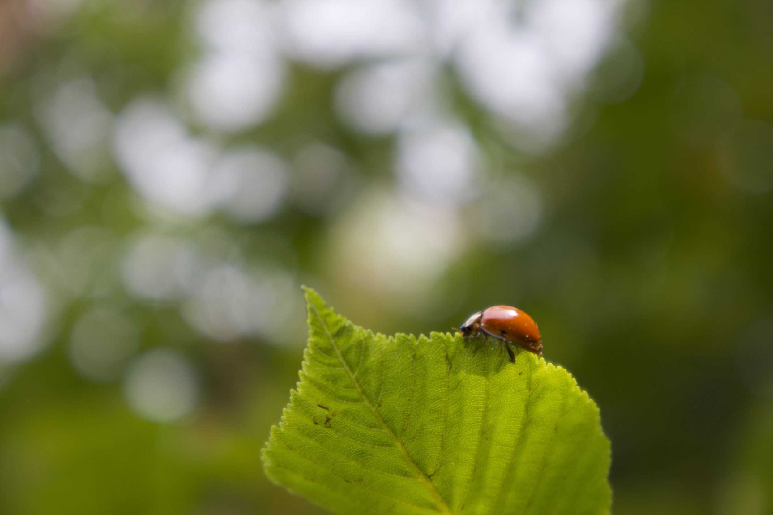
This one came about by chance I was taking some photos of flowers in a tree and just so happen to notice this little bug. I used Lightroom to bring up the saturation to made sure the asian beetle was the focal point the made it a sightly more red orange as I think its a better complimentary color to the green and made the greens slightly lighter. Added a lens bur to create a cleaner definition between the background and foreground. Finally i increased my sharpness and clarity to bring out the texture in the leaf
Taken: Khlem Garden
Before

After
The one thing (other then my pets) I do taken pictures of a lot is my art supples. I love how colorful art supplies photos are and also the various texture you can get. For this one I wanted to bring out the graininess and velvet look that oil pastels have, i made sure to bring up the saturations and increases to temperature, as well as add a grain to help highlight some of those features
Taken with a Canon EOS R50
Edited: in Adobe Lightroom
Before


After
Before
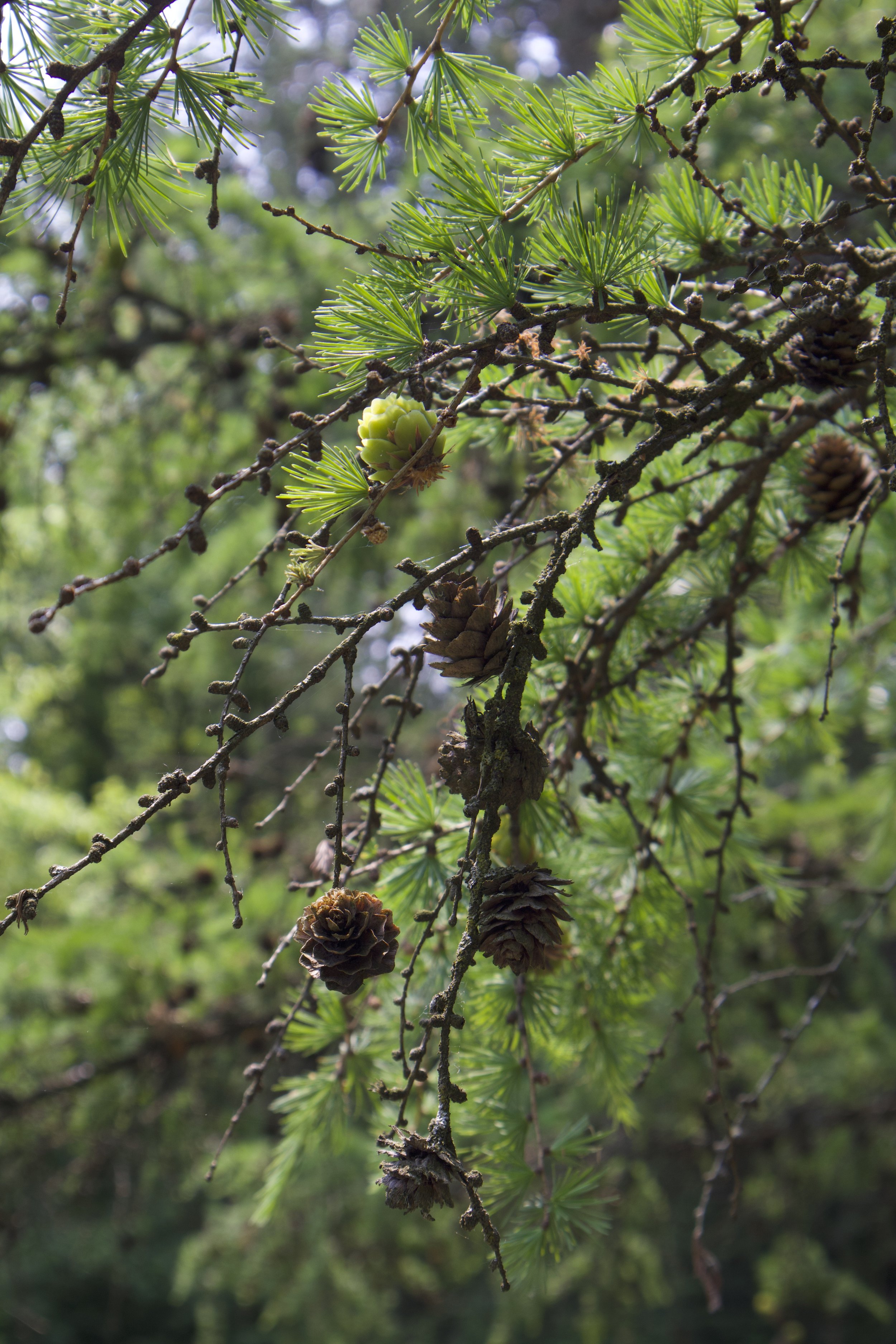
This was probably my quickest edit I was focus on bringing out the textures in the branches and pine cones. So i brought down the shadows and blacks increases the highlights. Warmed up the temperature and then focused on darkening up the greenery int he background and creating more depth in the greens by playing with the color levels for green.

After
Before
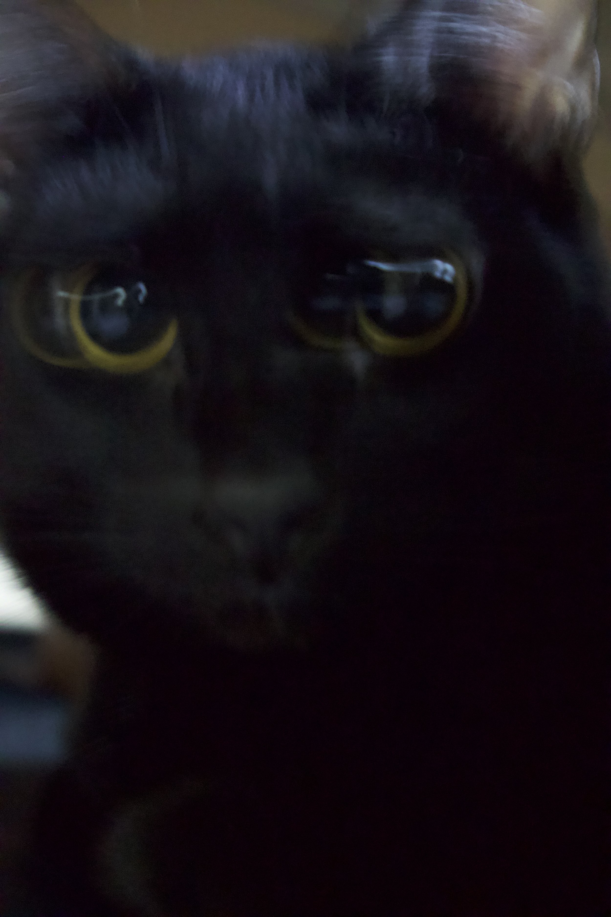
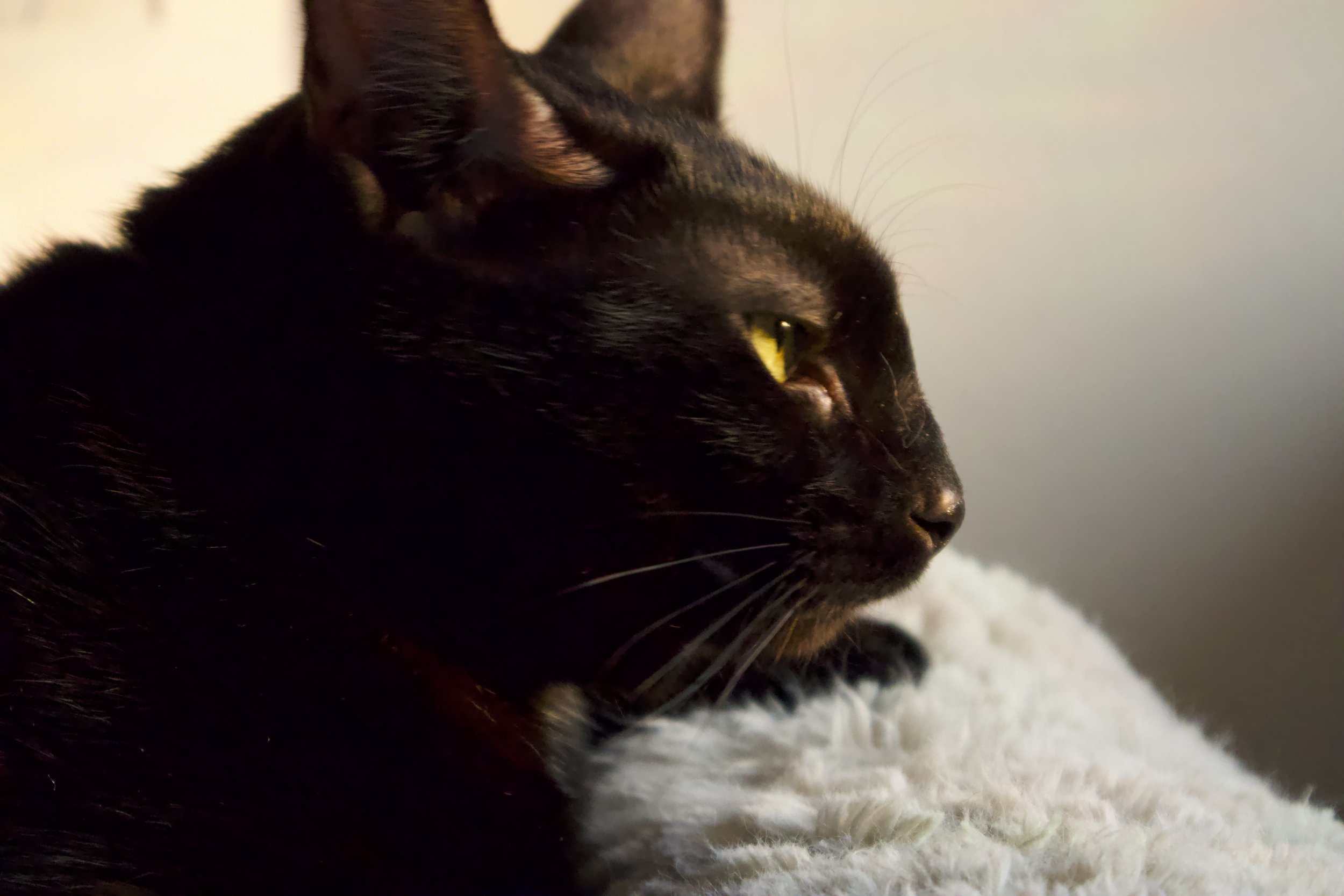
This is the only other photo I used Photoshop on i really light the bury effect ended up in with this one, but i did want to focus to the eyes so i gave it two masked layer one to have as soft light and the other to give a motion blur filter. From there I increases the temperature, sharpness and clarity again to give more focus and definition to the eyes

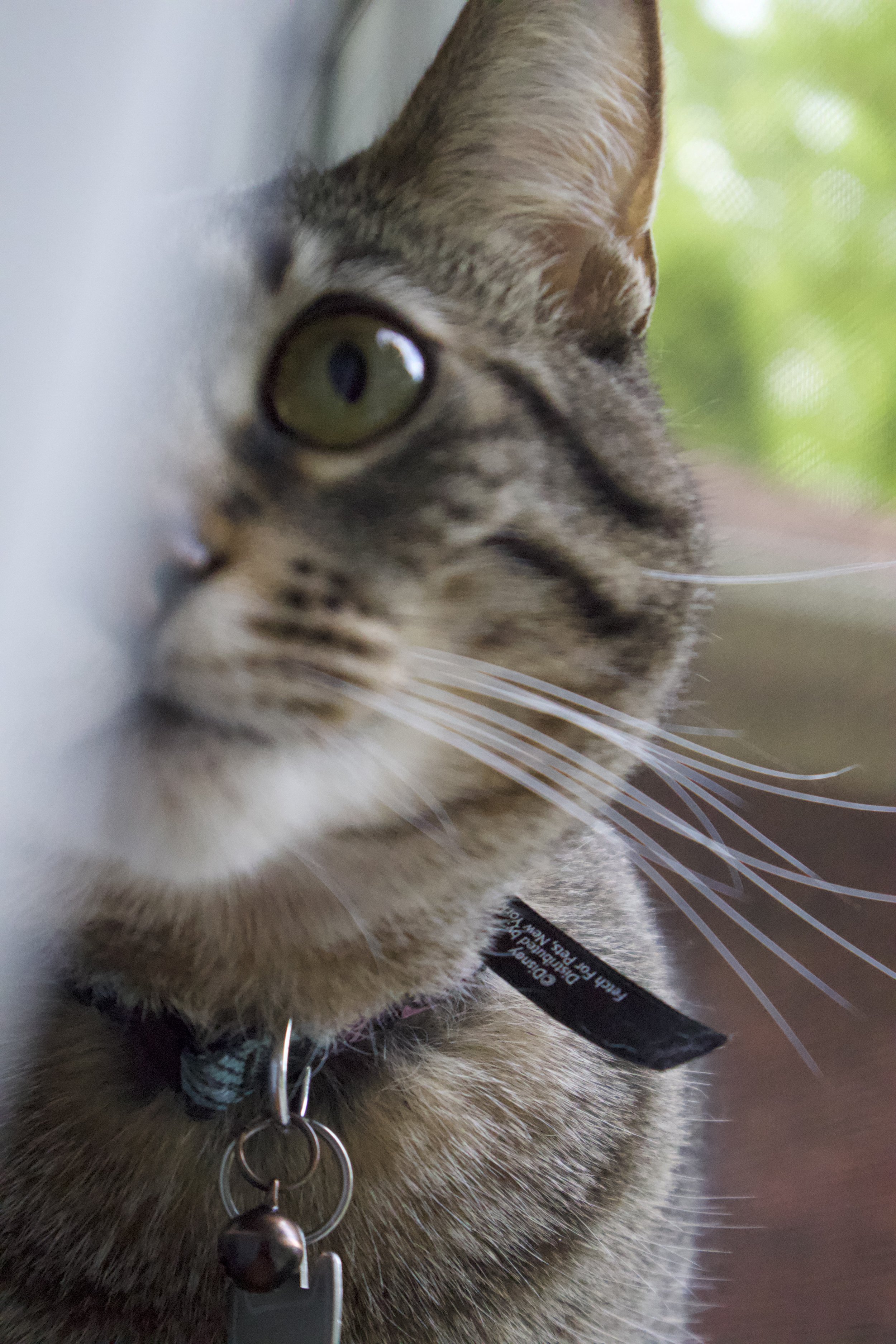
Before
This last photograph I think looks the most different from the before and that because i wanted it to look like it was taken in October and not Spring. I made sure focus on increases the oranges, reds, violets and even pinks to give it more of an autumn look and also turn down the shadows and blacks so the focus was more on her yellow green eyes.
